Charts and Graphs
Tips and techniques for producing graphical charts from hledger data.
The most general, lowest-common-denominator way is to produce simple CSV output
from a report and then make charts from that using the tool of your choice.
Eg, drag the CSV file into a spreadsheet and use its charting tools.
The balance command with –layout=bare and -N/–no-total is most often used. Eg:
hledger bal --layout bare -N expenses -o expenses.csv
The quickest way to get polished, ready-to-use charts as of 2025 is probably to export to Beancount format and then use Fava, a mature web UI with ready-made charts. (If this doesn’t work, you may need to alias some account names, eg; see Beancount output):
hledger print -o export.beancount
fava export.beancount
Here are some other ways:
Charting tools built for hledger
Simplest first:
hledger-web
hledger-web has a simple balance over time chart, in the register view. (demo)
hledger web
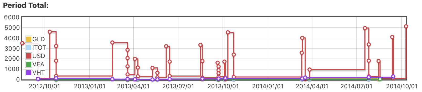
hledger-bar
hledger-bar (2023) is a bash script for making quick bar charts in the terminal.
$ hledger bar someacct
2023-01	+++++
2023-02	++++
2023-03	++++
2023-04	+
$ hledger bar -v 1 -f $TIMELOG biz
2023-01	        15 +++++++++++++++
2023-02	        10 ++++++++++
2023-03	        20 ++++++++++++++++++++
2023-04	        12 ++++++++++++
$ hledger bar -v 1 -f $TIMELOG biz -p weeklyfrom3weeksago
2023-03-27W13	         8 ++++++++
2023-04-03W14	         2 ++
2023-04-10W15	         4 ++++
2023-04-17W16	         5 +++++
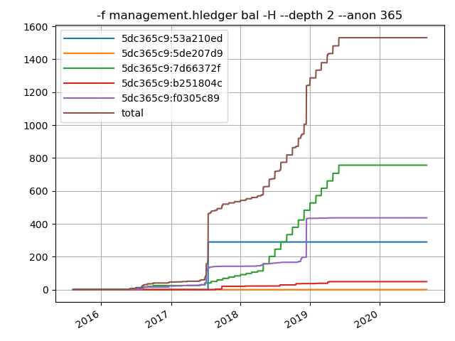
hledger-plot
hledger-plot (2023) is a powerful chart-making tool written in python.
hledger-lit
hledger-lit (2025) is a nice python web UI that makes several kinds of chart.
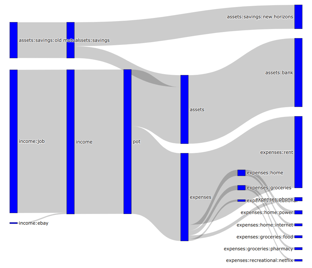
hledger-sankeymatic
At https://sankeymatic.com you can make flow diagrams in your browser,
from data records like Source [Amount] Target.
Here’s a rough script that exports the outflows from several asset accounts:
LEDGER_FILE=examples/sample.journal
for f in checking saving cash; do
  hledger areg $f -O tsv | tail +2 | sed -e "s/^/$f\t/"
done | cut -f1,6,7 | gsed -E -e 's/\$//' -e 's/([^\t]*)\t([^\t]*)\t([^\t]*)/\1 [\3] \2/' | grep '\[-' | gsed 's/\[-/[/'
hledger-sankeymatic is a better script to help you export hledger data to SankeyMATIC.
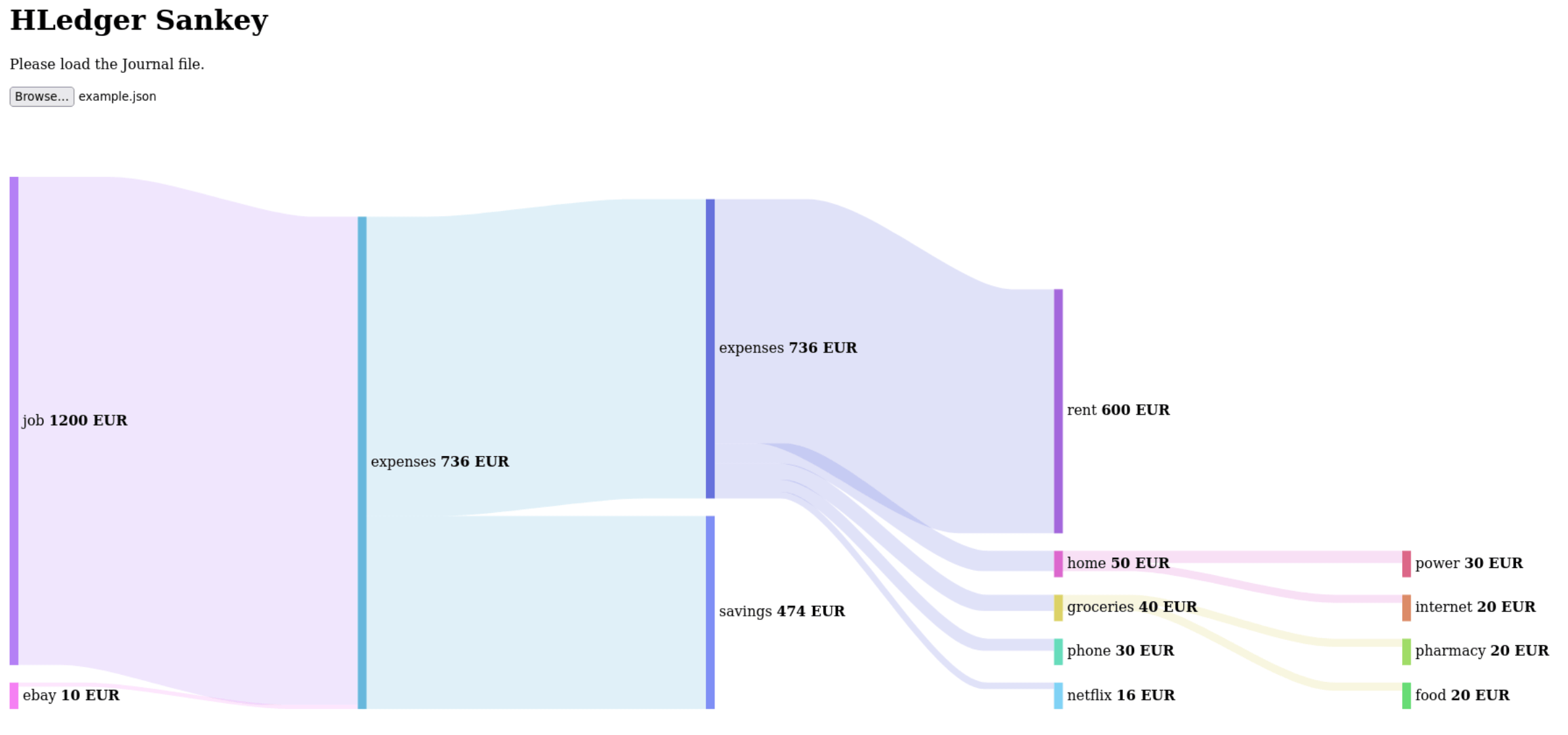
hledger-sankey
- https://github.com/adept/hledger-sankey is a python script using pandas and plotly to plot three sankey graphs of hledger data
- https://github.com/JustSaX/hledger-sankey is hledger-sankey made interactive with Streamlit
hledger-sankey-visualization
https://github.com/AlessandroW/hledger-sankey-visualization is a javascript that reads hledger’s JSON output, and uses amCharts.
hledger-vega
hledger-vega (2022) is a set of scripts for producing custom charts from your hledger reports, using the powerful vega-lite.
r-ledger
r-ledger is an R package for making reports and charts from hledger, Ledger or Beancount.
Grafana export script
Visualise your finances with hledger, InfluxDB, and Grafana (2017)
docker-finance metadata visualising
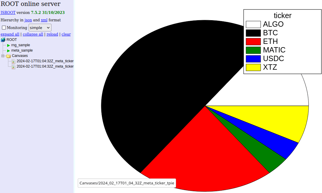
docker-finance, a hledger-based system, can visualise large quantities of metadata using ROOT.
Other charting tools
Ledger chart tools
Tools built for Ledger can sometimes be adapted to work with hledger also; or, hledger data can be exported to Ledger-readable files. Eg:
- Report Scripts for Ledger CLI with Gnuplot (2016)
- ledger-plots (2018), an R package that makes PDF charts from Ledger
- More can be found at the PTA site: GUI, web, mobile, other
ploterific
ploterific (stack install hvega-theme ploterific) produces simple charts,
in a HTML file that uses the Vega-Lite javascript library.
Charts can also be saved as SVG or PNG. Here’s a detailed example:
hledger -f examples/bcexample.journal bal -O csv -N expenses -3 cur:USD \
    | sed 's/ USD//' \
    | ploterific -m Bar -f account:N -f balance:Q -c account -o a.html \
    && open a.html

Let’s break down that command line:
-f examples/bcexample.journal- use this example file in the hledger repo. Omit this to use your default journal.bal- run a balance report-O csv- show it as CSV on stdout-N- disable the final Total rowexpenses- limit to accounts whose name containsexpenses-3- summarise accounts to depth 3 and abovecur:USD- limit to balances inUSDcurrency. If you use the$symbol, it would becur:\\$.sed 's/ USD//g'- process the output with sed, stripping theUSDsymbols to leave bare numbers for ploterific. With$it would besed 's/\$//g'.-m Bar- useBaras the Vega-Lite mark type-f account:N- use theaccountcolumn as the first feature (X axis), treating values as names-f balance:Q- use thebalancecolumn as a second feature (Y axis), treating values as quantities-c account- useaccountvalues to select colours-o a.html- save into a temporary HTML file&& open a.html- and view it in your web browser, on Mac; on other systems it might bexdg-openorstart
Here is the same chart but with the colour set by the balance:
hledger -f examples/bcexample.journal bal -O csv -N expenses -3 cur:USD \
    | sed 's/ USD//' \
    | ploterific -m Bar -f account:N -f balance:Q -c balance:Q -o a.html
